Nobody opens a restaurant because they dreamed of loving spreadsheets. But talk to the operators who are actually staying profitable right now, and you’ll notice a pattern: they check their numbers on a schedule, not just when the shift feels off, or the till comes up short. That habit matters more than ever. According to the National Restaurant Associatiom, 42% of restaurants were not profitable in 2025, and cost pressures haven’t eased up in 2026. Full-service labor alone runs at a median of 36.5% of sales, while the operators who managed to stay in the black held it closer to 34.2%. That two-point gap isn’t luck, and it isn’t magic. It allows staff to know what is happening in the business from a greater perspective as opposed to only seeing what’s happening in front of them.
Daily Sales Summary
Most operators glance at this one, but “how’d we do today” is only the beginning. Pull it apart by daypart, service type, and category to see where sales are actually coming from, not just the total at the bottom. A flat top-line number can hide a bad lunch and a great dinner (or the reverse), and those are two very different problems wearing the same disguise.
Real-Time Labor Cost vs. Sales
Finding out labor got away from you when payroll runs is the most expensive way to learn that lesson. A live labor-to-sales report, checked mid-shift, gives a manager the chance to send someone home early or call in backup while there’s still time to do something about it. With labor costs sitting well above historical norms industrywide, this report has quietly graduated from “nice to have” to daily requirement for most concepts.
Voids, Comps, and Discounts
This report tends to get ignored until something looks wrong, which is exactly backward. Checked daily, it’s one of the fastest ways to catch training gaps, POS hiccups, or (less often, but it happens) actual misuse. Look for patterns: the same employee, the same time of day, the same excuse showing up a little too often.
Sales Mix by Menu Item
Not every item on your menu is pulling its weight, and total sales won’t tell you which ones are coasting. A sales mix report shows what’s actually moving, and paired with your food cost numbers, it flags the dishes that are popular but thin on margin. Beloved and profitable are not always the same thing.
Cash vs. Card Reconciliation
This is a daily close-out, not the monthly review. Catch a discrepancy the same day it happens, and you’re checking a drawer count and a shift log. Catch it three weeks later, and you’re checking your memory, which is a much less reliable witness.
Weekly Prime Cost Snapshot
Food cost and labor cost each tell you half a story. Together, as prime cost, they tell you whether the business is actually healthy. Industry guidance generally puts a sustainable prime cost in the 55% to 65% range of revenue, and operators who let it drift past that band are far more likely to end the year in the red.
Table Turn Time ~ Covers per Labor Hour
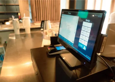
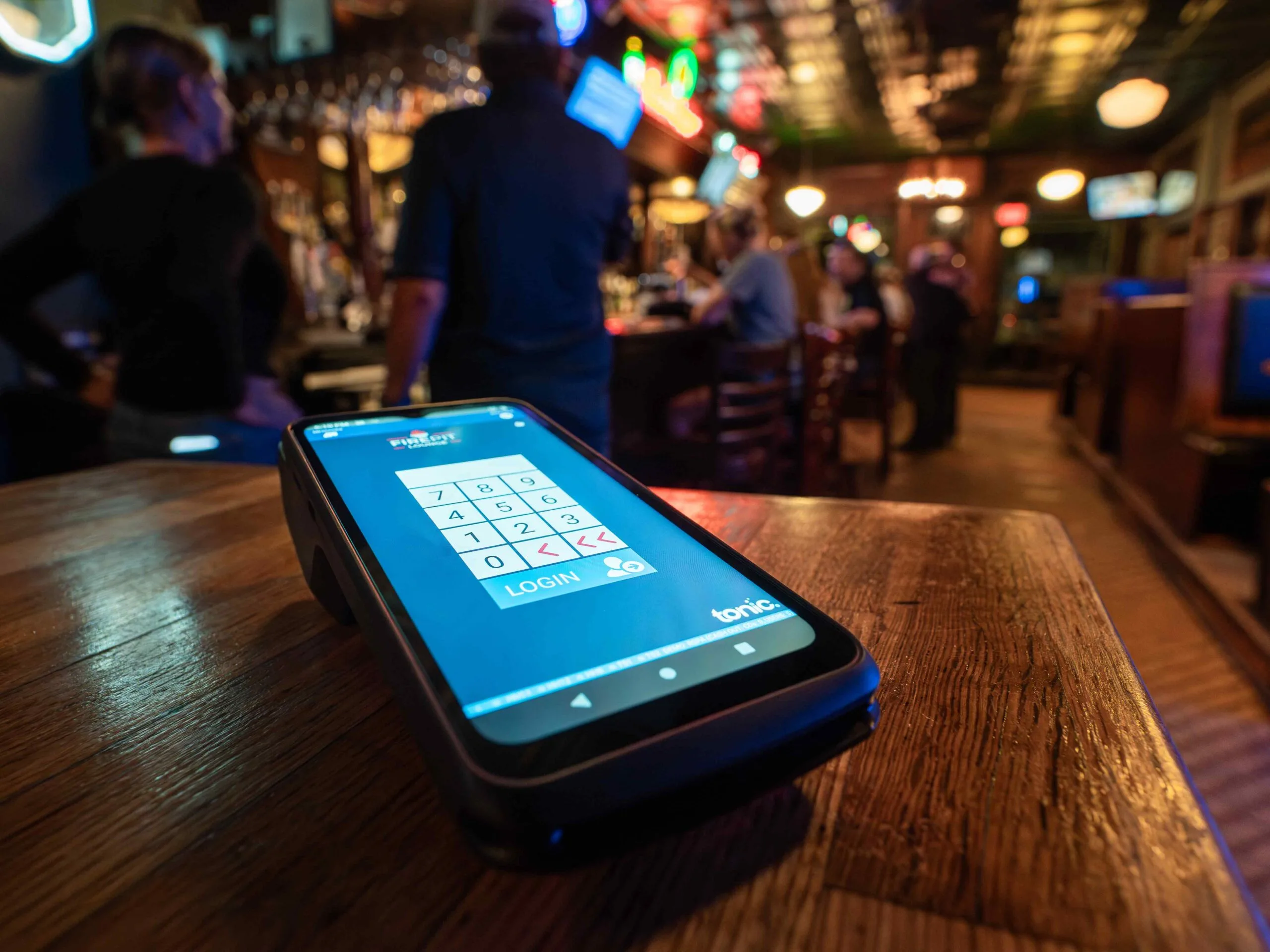
For full-service concepts especially, this report connects two things operators usually track separately: how fast tables turn and how many staff hours it took to make that happen. A dip in turn time alongside flat labor hours is often the first visible sign that service is starting to strain at the seams. None of these reports are complicated to pull, especially when your POS puts them in front of you instead of making you dig. The Tonic dashboard surfaces a lot of this at a glance: net sales, order counts, staff on shift, an hourly sales graph, and labor cost by hour, all visible the moment you log in. If you’re not sure whether your current system is giving you that kind of visibility, Tonic’s Dashboard walkthrough is worth a look.